Showing posts with label digipak analysis. Show all posts
Showing posts with label digipak analysis. Show all posts
Thursday, 11 December 2014

Monday, 1 December 2014
Researching the use of Homage in industry


Pet Shop boys with their 'Actually' album was a remastered version of Field Music- Actually, nearly and was designed by multi-award winning Farrow Design; an organisation specialising in design, branding and art direction after having worked with various clients in various industries such as retail and art galleries.
This is one example of a homage, and despite the Pet Shop Boys creating music within a different genre (electro-pop) to Parables (indie rock) the idea to replicate conventions from one cd cover onto another after original success has been proven to be effective as the outcome appears stylish and classic, exciting the audience and showing the designer skill in terms of high levels of detail. Conventions from Field Music's original were copied directly, such as fonts, alignments, colour scheme, content of image, placement of image, etc. I feel this works well. After finding this, I decided to explore the use of homage featuring as front cover images further.
This is one example of a homage, and despite the Pet Shop Boys creating music within a different genre (electro-pop) to Parables (indie rock) the idea to replicate conventions from one cd cover onto another after original success has been proven to be effective as the outcome appears stylish and classic, exciting the audience and showing the designer skill in terms of high levels of detail. Conventions from Field Music's original were copied directly, such as fonts, alignments, colour scheme, content of image, placement of image, etc. I feel this works well. After finding this, I decided to explore the use of homage featuring as front cover images further.


Clinic's Internal Wrangler album includes tracks of the indie rock genre. The cover was inspired by Ornette Coleman's 'Ornette' album created 40 years prior. The resemblance is clearly noticeable, using conventions including font type, size and style, interestingly distorted shaping surrounding the album title and the use of and blue and yellow colour scheme. I feel this is effective and appears retro and stylish. There is little difference in album covers although they are clearly not exactly the same. Modifications made include the album title/ band name, differing shades from original colour scheme and different distortions of shapes in different places. I feel it is acceptable and a likeable idea to homage previous album covers as elements of vintage styling emphasise the nature of the indie rock genre in an attractive and modern way.

Monday, 24 November 2014
Digipak research
Style Research:

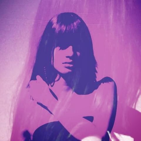
I liked the idea of a pop art image being displayed on the cover as it would stand out and draw attention to the digipak. The use of a close up image being transformed into pop art was something which I thought would suit the quirky genre of the music featured on the album and would create an image for the audience to develop and interest in.
Colour Scheme and layout research:

The layout for my digipak was largely inspired by Bombay Bicycle Club- Flaws. I liked the simple designs which were kept through fonts and colour schemes. The overall appearance of the digipak makes a statement and leaves an impact on the audience.
Indie representations:

Themes within my digipak and advert are similar to those featured on 'Flaws'. I recreated the image of the female on the front cover using a peer to model. The expressions are vague and minimal creating a mysterious and interesting feel about the album. The indie genre is also presented through the mise en scene of the album cover image. The clothing/styling of the model used includes a paisley printed shirt; this is not in line with current trending fashions and is therefore appealing at typical indie individuals, enticing them to take a look and develop interest in the album as it appears to fit their preferred genre. The fonts and layout are also outside of typical digipaks created for bands in genres excluding indie/alt. Features including the right alignment and thin, basic fonts used all contribute towards achieving a 'different' yet effective look for the digipak and advert.
Friday, 17 October 2014
Subscribe to:
Posts (Atom)