Thank you for taking the time to look through our coursework that we have been working on this year, we hope that you enjoy looking through our research and planning. All posts are labelled and can be found on the blog at the top right hand side. We have enjoyed this course over the past 2 years and have collectively come together as a group to produce a video that we are all proud of.
Once again, Thank You!
Showing posts with label Sophie Beeston. Show all posts
Showing posts with label Sophie Beeston. Show all posts
Tuesday, 17 March 2015
Friday, 30 January 2015
Thursday, 29 January 2015

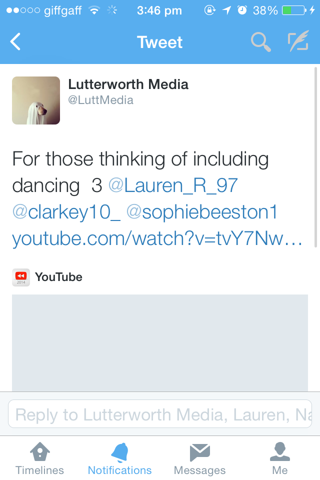
Friday, 12 December 2014
Evaluation 4 (draft)
4. How did you use media technologies in the construction and research, planning and evaluation stages?
When making the digipack, advert and the music video i used different forms of technology to create, develop and promote each different media products.
Pre Production -
Twitter (Private account (Lauren, Sophie, Lauren) @parables)
Blogger (Group blog, Mr ford, Mr smith, Classmates)
Email (Google mail, Outlook)
Internet (Safari)
Chrome
Apple mac
Scribd
Flickr
Animoto
Production -
Camera (SLR, VHD)
Lights
Tripod
Shoulder stand
I tunes
I pod
I phone
Post Production -
Twitter
Blogger
YouTube
Final cut pro
Apple Mac
I tunes
When making the digipack, advert and the music video i used different forms of technology to create, develop and promote each different media products.
Pre Production -
Twitter (Private account (Lauren, Sophie, Lauren) @parables)
Blogger (Group blog, Mr ford, Mr smith, Classmates)
Email (Google mail, Outlook)
Internet (Safari)
Chrome
Apple mac
Scribd
Flickr
Animoto
Production -
Camera (SLR, VHD)
Lights
Tripod
Shoulder stand
I tunes
I pod
I phone
Post Production -
Blogger
YouTube
Final cut pro
Apple Mac
I tunes


Evaluation 2 (draft)
Evaluation Question 2
How Effective is the Combination of Your Main Product and Ancillary Texts?
- The styling that has been used through my digipack, advert and music video are all linking, all have the minimalistic look about them, all three have the monotone colour pallet used throughout. This links back to the genre again of indie/alternative. My digipack and magazine cover are stripped back plain and simplistic with bold shapes and a text that stands out, this again is linking with my video the way in which the dancers are dressed are simple and minimalistic, I feel that as we filmed in a plain white room this made the black costume seem bold and were made to stand out.
- From looking at other digipack's and adverts already produced taking The XX for example, these also have a stripped back look about them using the monotone colours. I feel that this look will attract my target audience.
- A typical point that you will see in videos the male is the main vocalist this have given the video a polished look, again relating to the digipack and advert as they too are both polished.
- The typography that I decided to use on my digipack and advert again matches with the text on the music video with a black background and white text, this also links with the white room and the black costume.
- The shots that are used throughout my video show the narrative of this story line that the girl dancer is in his imagination. The way that the shots and the order of them are shoed portray the meaning the audience.
- The way that the dancers are styled are showed continuously through the ancillary texts.
- Neither of the dancers make direct eye contact with the camera lenses apart from when the boy is lip syncing, throughout this they are both showing emotions though their faces and towards each other this connects and engages the audience in. Both have taken it seriously and want to ensure that they can relate to the public by showing the narrative meaning.
Our route to the filming location
We travelled by bus on the X44 to get to our filming location after college as none of us are yet to be driving, this is the route that we took:-

Monday, 8 December 2014
Evaluation 1 (draft)
Evaluation Question 1:
In what ways does your media product use, develop or challenge forms and conventions of real media products?
MUSIC VIDEO:
The Parables new music video 'my body is a cage' has developed Slow Club -Two Cousins,
Slow Club - Complete Surrender, Sia - Chandelier, Ed Sheeran - Thinking out Loud as a narrative has been established. Before deciding on the type of video we wanted, we researched and analysed different styles we could use. Having taken inspiration form Slow Club - Two Cousins through the basic set up of the white room, the shots and angles used, we took the performance element of this video and combined a story line. This lead to the decision of the song choice that we had, we feel that we could portray deep emotions and feelings to an audience. The reason for choosing a narrative performance is because we feel that it complimented the artists style, more of a performance based video would go against and contradict this as the band is more of a vocalist performance than performers with instruments.
Conventions that we used from real media products such as Ed Sheeran - Thinking out Loud this showed a relationship between the male and female dancers, we thought that this was an effective way of showing feelings and emotions by dancing as a perdedor (in a partnership). Therefore this is one of the main conventions we used in our own video. We also took inspiration from Slow Club - Two Cousins, Slow Club - Complete Surrender as both of these videos are filtered in black and white, we thought that this was effective and was able to reflect the mood and atmosphere of the shots that we chose to use this was the best way to show the genre of the artists style.
DIGIPAC AND ADVERT:In what ways does your media product use, develop or challenge forms and conventions of real media products?
MUSIC VIDEO:
The Parables new music video 'my body is a cage' has developed Slow Club -Two Cousins,
Slow Club - Complete Surrender, Sia - Chandelier, Ed Sheeran - Thinking out Loud as a narrative has been established. Before deciding on the type of video we wanted, we researched and analysed different styles we could use. Having taken inspiration form Slow Club - Two Cousins through the basic set up of the white room, the shots and angles used, we took the performance element of this video and combined a story line. This lead to the decision of the song choice that we had, we feel that we could portray deep emotions and feelings to an audience. The reason for choosing a narrative performance is because we feel that it complimented the artists style, more of a performance based video would go against and contradict this as the band is more of a vocalist performance than performers with instruments.
Conventions that we used from real media products such as Ed Sheeran - Thinking out Loud this showed a relationship between the male and female dancers, we thought that this was an effective way of showing feelings and emotions by dancing as a perdedor (in a partnership). Therefore this is one of the main conventions we used in our own video. We also took inspiration from Slow Club - Two Cousins, Slow Club - Complete Surrender as both of these videos are filtered in black and white, we thought that this was effective and was able to reflect the mood and atmosphere of the shots that we chose to use this was the best way to show the genre of the artists style.
I wanted both pieces of work to be as minimalistic as possible taking inspiration from modern covers such as Arctic Monkeys, The XX and also ACDC all of these covers are plain and simple I felt that this was best suited to my designs so I followed these designs, all had little if any text and this stood out as its focus point was on other things, The so called typical features that you will find on my work are the barcode, record label, terms and conditions and the band albums name these will all be found on existing media products (mainly for the legal reasons of a recording label) This is shown through my research of album covers. I didn't use and images for my work as I waned it to be plain so I went with simple shapes, however this have given it and effective professional look throughout relating back to the genre of indie. The audience feedback the I revived all seemed to be positive as both pieces of work matched and complemented one another I have chosen to use monotone colours so they work well with one another. I have also designed my own minimalistic record label which is also found on most media products, I have decided to keep this small so it doesn't take the attention off of the main piece itself. Throughout all three media products I have created I have kept constant with the minimalistic look and the black and whit colour, this is effective as the audience know what there looking for if they were to purchase the products.
Evaluation Questions 1,2,3&4
1. In what ways does your media product use, develop or challenge forms and conventions of real media products?
2. How effective is the combination of your main product and ancillary texts?
3. What have you learned from your audience feedback?
4. How did you use media technologies in the construction and research, planning and evaluation stages?
2. How effective is the combination of your main product and ancillary texts?
3. What have you learned from your audience feedback?
4. How did you use media technologies in the construction and research, planning and evaluation stages?
Monday, 24 November 2014
Digipack journey

- The first cover of ACDC shown inspired me from the font used on the cover.
- The inspiration came from the simplicity of the cover
- I have been experimenting with different texts to see which would suit my raft design best.
- This third cover is a well known band i like the use of the colour black and white and also the font used is different to anything already produced.
- The arctic monkeys cover inspired me from the plain line that is used across the middle o the cover.
- The next three colours are the ones that i chose for my draft, i feel that the green is striking and will strand out.
- Again on this cover i like that lines that are used, however these lines create a shape within the cover.
- I like the plain text used in the middle of the page.
- The three smaller images underneath i like because of the colours used and also the bold fonts.
- The Emile Sande cover inspired me because of the focus on the center of the picture and the colour difference.
- On the next cover i have chosen i like the contrast of the bole block colour of block and white with one colour that's different to the rest. I feel that a lot of my inspiration will be taken from this for my draft digipack.
- The next 4 smaller covers i took the inspiration of the texts used and also the colours of the plain black and white.
- My next cover i like the sharpness of the two colours as i feel that they are contrasting to one another.
- The next four pictures i have chosen is purely for the colour and the sharpness of them.
- This is my first draft of the front cover of my digipack. i have taken inspiration of using one block colour like on the e xample cover however i decided to use green as i feel it stood out more. then i have take the other two colours of black and white which are shown on most of the covers. also i used the lines and took inspiration from a couple of the previous covers. then chose a font that i liked and added it onto the front cover. this is how i came to make my draft cover. from having feedback form my draft I changed my idea as I was told the lines had no meaning and looking back at it now I can agree with this as there was no reason for them to be there, I then continued to research for other cd covers.
- I then chose 2 colour palates, again keep the back and white theme throughout my original idea.
- The next cover with the black and white with the pink/red writing inspired me because of the use of shapes that were used on the front cover.
- the cover with the triangle and colours running through the ,idle inspired me as there was still a black and whit theme, however the bold shape I can also take inspiration from.
- Again this next cover I got inspiration from the colour and the different patterns that were used throughout.
- The next 2 smaller images I chose because of the block shapes and bold colours, even though one of these isn't in black and whit I can use it as inspiration as the sharpness of the shapes has inspired me.
- The next cover I have chosen is very different however I liked the different shapes and lines that were used on the front as it made the cover look random and stand out from others.
- The XX cover I have chosen I like because of the simplicity and the plain colour choice, this is how I wish mine to be like in the final digipack.
- Again I have looked at a various amounts of fonts that I could use on and throughout my digipack design.
- I found this cd cover and immediately loved it as it was bold clear and straight away stood out and appealed to me, I would love to incorporate this into my final design.
- And these final 3 covers gave me inspiration from the block shapes used, however I will want to have the colour as my original idea and keep to the black and white theme.
- Finally this is the final design that I came up with, I feel that I have taken some aspects of different covers and have made a big improvement from my draft, I think that it looks slick and professional.
Friday, 14 November 2014
Creating the final dance
Creating this final dance was a challenge as we didn't have a lot of time, we only had 2 days for 1 and 1 1/2 hours at a time so this was a challenge to get everything in, however we were both focused on task and managed to get some of the tasks done however we didn't finished it all so on the day of filming we had to make some sections up on the spot although on the final piece it looks slick and well rehearsed.
Equipment used
Camera - The camera that we used was a .... its not a professional camera so hasn't got the best of qualities, however once all our shots have gone through final cut pro we have changed the colour of the film to black and white as it fits in better with our theme to show the emotions across more.
Tripod - The tripod helped us keep a steady shot throughout the side shots we were filming also we were able to adjust the height so that we had the dancers central of the screen. A tripod is a portable three-legged frame, used as a platform for supporting the weight and maintaining the stability of some other object. A tripod provides stability against downward forces and horizontal forces and movements about horizontal axes.

Shoulder stand - We ordered in a shoulder stand so that we could keep a steady shot when moving around the room to create stability for the camera filmer.

Lights - Light's radiant energy, in these circumstances they are producing shadows on the back wall also we learnt about three-point lighting, this is a standard method used in visual media such as theatre,video, film, still photography and computer-generated imagery.

Tripod - The tripod helped us keep a steady shot throughout the side shots we were filming also we were able to adjust the height so that we had the dancers central of the screen. A tripod is a portable three-legged frame, used as a platform for supporting the weight and maintaining the stability of some other object. A tripod provides stability against downward forces and horizontal forces and movements about horizontal axes.
Shoulder stand - We ordered in a shoulder stand so that we could keep a steady shot when moving around the room to create stability for the camera filmer.
Tuesday, 11 November 2014


%2B-%2BCopy.jpg)
%2B-%2BCopy.jpg)


Friday, 7 November 2014
Final digi pack

Recently i have been given feed back on my first drat of my digipack. This is my CD cover digipack for my cover that i am making for the album that our song will be appearing on. i feel that it has developed a huge amount form my first idea as i have taken the lines out as they looked scruffy and a bit all over the place and had no purpose to be there. i have decided to still use lines however block square lines to give more structure i have looked through some books and taken bits i feel will work as i wanted the look to be quite plain and simple to match the atmosphere of the music on the playlist.

I feel that from the feedback that i was originally given i have developed my idea a lot and it appears less busy and more structured. i think that by using just the two colour allows you to look at all of the poster and digipack without being distracted by one single colour.
Friday, 31 October 2014
Friday, 17 October 2014
Subscribe to:
Posts (Atom)