Sunday 28 December 2014

Evaluation Question 1- Draft

IN WHAT WAYS DOES YOUR MEDIA PRODUCT USE, DEVELOP OR CHALLENGE FORMS AND CONVENTIONS OF REAL MEDIA PRODUCTS?
 
Music video:
Our music video often uses many 'typical' forms and conventions of existing music videos within the indie rock/pop genre. I feel this is important to incorporate as it shows understanding and keeping up to date of what the industry is presenting and enables us to achieve a realistic, effective and engaging final product. Using 'normal' conventions of indie music videos has allowed us to successfully reach and interest our target audience as the used features have proven to be effective among these individuals as the existing videos have been successful at producing a video in this genre.
 One example of our music video using normal conventions of indie music videos is through the opening scene featuring the title sequence presenting a form of star image motif using the name of the band and title of the song as the introduction, so the audience would be made more aware of the band and single belonging to them in future when they may come across it again- more memorable and prevents confusion of details of the single for the audience. The star image motif is created through using identical fonts on the title sequence as featured on the digipak and advert promotions.
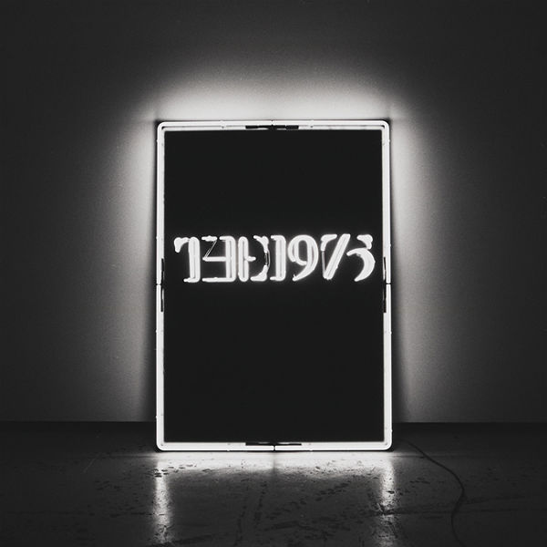
Title introduction is something also used within music videos of many artists/ bands in this style of music, such as The 1975- Girls, George Ezra- Budapest, and many more. It could be recognised that we have developed elements of this convention used as the 'Girls' video presents the title in flowered lettering, where as our video created for Parables displays in a stylish, basic white filled font to create a sense of simplicity and minimalism from the beginning. However the convention in general has been used as the same outcome is achieved.
(PRINT SCREEN RESEMBLANCE SHOTS WITH TWO COUSINS)
There are many examples showing clear similarities between the video we created for Parables and Slow Club - Two Cousins. Firstly, Slow Club's video features an extreme close up shot of the male dancer's hand; we also ensured this was featured in our video to emphasise emotion and feelings, we decided to replicate this convention to help deliver our message of frustration across better. When viewing both videos, the audience would be able to recognise the basic mise en scene. A major feature of our video was the white room in which the video was shot to create a sense of isolation and to ensure that all audience focus is kept on the intriguing storyline and characters. The setting inside of the white room is a convention which is also taken by Slow Club in their Two Cousins video. Another convention used in Parables' My Body is a Cage as well as Slow Club's Two Cousins is the effect of slow motion added during the production/ editing stages of creation by both parties. This features is combined with the normal speed dance clips in both music videos and is something which I feel is effective in breaking up the video and adding emphasise onto certain points.
(PRINT SCREEN SHOWING B&W EFFECT IN VIDEO)
(PRINT SCREEN B&W IN EXAMPLE VIDEOS)
A convention used in Two Cousins, as well as many other indie genre music videos including the 1975- 'Chocolate', Hoiser- 'Take Me To Church', etc. is the effect of black and white added onto the clips throughout the entire video. I feel this is effective in presenting emotion clearly and allows the main focus of the audience to be on the storyline presented through the actions and emotions of the dancers, with no colour shown to distract or catch the eye of the viewers to take their minds off of this- more engaging as a result. This is a convention which is used across various genres of music and I feel it also brings and element of stylishness, emphasising the minimalistic theme which is created throughout the video.
(PRINT SCREEN EXAMPLES OF THESE SHOTS ON VIDEO)
(PRINT SCREEN RESEMBING SHOTS FROM EXISTING MUSIC VIDEOS)
Used conventions include the various camera angles/shots used and combined during the editing stages of creating the video. Each shot and angle used (mid-shots, close ups, extreme close ups, wide shots, panning shots, tracking shots, high angles, eye level angles, side angles, two shot and cut in shots) are 'typical' conventions of music videos in most genres, including indie/alt, and are therefore a demonstration of how we have adopted forms and conventions used in industry within My Body is a Cage.
In the introduction of Parables - My Body is a Cage, we chose to incorporate digetic sound of the setting up of the video. This is something used often in industry by indie artists/bands such as The 1975 -Heart Out and Arcade Fire -The Suburbs.
 
I feel that in order to achieve a successful, effective and interesting music video, some sort of development should be made on those existing to enable creation of something which stands out, engages audience and is memorable.
(SHOW PINK- TRY)
(SHOW SOPHIE AND CAM IN SHOT TOGETHER)
(SHOW TWO COUSINS)
I also believe there are many examples of how we have developed forms and conventions used by 'normal' indie style music videos. For example, despite Slow Club- Two Cousins using performance conventions similar to Parables (dance), there was no element of meaning/ narrative behind it all. Unlike that featured in Parables' music video as this has a clear, expressive storyline presented to the audience throughout the entire production. Therefore, it could be recognised that we have developed on the idea of dance taken by Slow Club and created a completely different end product through a meaningful story behind the motions. I feel development of conventions has also taken place from P!NK- Try; the narrative is very similar as she presents a situation of heartache with the opposite sex through dance performance, however we have created a similar storyline in our video but developed on aspects of the mise en scene to make it seem more indie style and appropriate to our chosen song.
 
Other ways our video develops typical conventions of existing ones includes the element of performance narrative featured. This is known to be outside of the norm for indie genre videos as footage of live performance involving instruments is usually shown in the videos of indie bands such as The 1975, Metronomy, etc. From the beginning of the process, we intended to create our music video with a performance narrative which shows visuals and music fitting, therefore much of our research was based on existing videos also featuring contemporary dance. We found that this is usually a convention taken in the mainstream/pop genre of music videos- going against common conventions of indie genres. Often with indie/alt videos at present time, live performance is a typical convention but combining with a narrative is a modern twist to break up the music video and engage the audience through a more memorable series of events being shown.
It could be said that mise en scene, with relation to costume is a convention which challenges existing music videos, such as Ed Sheeran - 'Thinking Out Loud'. Our draft version presented two dancers who lacked personality and quirkiness; the basic dancer style costume did not achieve a suitable look for our intended narrative, therefore a change was required for the final version. This involved purchasing a vintage, metallic shift style dress for the female dancer, along with a smart shirt and bow tie for the male- this was something we were confident expressed a sense of identity and character for the dancers to be seen as real people. However, the idea had to be altered as we experienced an issue with the costume not fitting Sophie (the female dancer.) In this situation was had to use the only other alternative which was a plain black T-shirt of Cameron's (our male dancer) which was large enough to be seen as a dress on Sophie. This resulted in our video taking a minimalistic approach through the basic mise en scene, which was unintended but is something I feel we managed to execute to a high standard. This opposes that of 'Thinking Out Loud' as this presents the dancers in formal, elegant costume adopting a more extravagant approach. 
Development of Sia- 'Chandelier ' occurred intentionally as we set out with the idea to feature contemporary style dance. Therefore there are noticeable used conventions in our video taken from Sia's; however, I also would say that there are examples of development too. One example of development would include features of the mise en scene. The house setting in which the young girl dances within 'Chandelier' is something in which I feel we developed as both videos performed within a confined space using the walls to suggest isolation. However, I feel our white room setting was more appropriate for our video as it matched the meaning behind the song and helped achieve the idea of the space being a place inside the male's head. The blank canvas type space appeared much more restricted and allowed focus of the audience to be kept on the storyline and characters rather than the distraction of a busy mise en scene.


Digipak and Advertisement:
Due to the nature of a homage, my design for ancillary texts used conventions of real media products as it is effectively a direct copy of Bombay Bicycle Club- Flaws through layout, fonts being similar, colour scheme,etc. However I combined the look of Franz Ferdinand to develop the Flaws album and added a pop-art style effect to the image of the female on the front cover. The front cover image, and that featured on the advert, uses a close up shot. This is a convention largely used on albums and adverts in industry across a variety of genres. Indie bands/artists using this convention include Kings of Leon ('Youth and Young Manhood'), Lana del ray ('Born To Die'), The Libertines ('The Libertines'), etc.
(SHOW IMAGES OF THE ABOVE)

Saturday 27 December 2014

Evaluation Question 2 -draft

How Effective is the Combination of Your Main Product and Ancillary Texts?
 (photo of indie groups)

I feel both main product (music video) and ancillary texts (digipak and advert) are effective In targeting the intended audience who would be fans of the indie/alternative genre.
(photo of digipak cover and advert)
The digipak and advert are naturally very similar in appearance and style as fonts, colour scheme, alignments and imagery were translated across the two products. This was intended to create a form of branding for the band on release of the debut album to allow the audience to notice the similarities in both products and be able to identify the digipak/advert belonging to Parables when they are exposed to the ancillary texts in future. (Screen shot of video titles)
In the opening of the music video I used identical fonts to the digipak and advert 'Orator Std' to further emphasis the branding of the band. The sharp and stylish appearing fonts create a sense of formality and allow the viewers to gain an idea of complexity and seriousness of the narrative within the video and od content within the album as a whole.
 (section of video and cover of digipak and advert)
However there are few correlations between the ancillary texts and the music video created for Parables in relation to styling. The music video adopts a minimalistic approach through the costume shown in the mise en scene and the black and white effect added onto the footage. This element of simplicity could have been employed on the digipak and advertisement, however I decided to play on the stylish and edgy aspects of Pabables given from the music video and translated this into the ancillary texts. Emotions and a sense of heartache is something which is portrayed clearly to the audience through each of the products, making them very effective. The music video expresses the male figure's desperacy to escape a relationship as it is isolating the individual, where as the digipak and advert shows this from a different perspective through using a female (focus is on opposite sex to the music video) to express the same feelings through the still image of a female appearing sorrowful and downhearted. All products appear stylish and classic with a clear boldness giving them the ability to make a statement. Reinforcing essentially the same message through the music video and ancillary texts for Parables creates a functional and effective image for the band.(digipak and back cover)

The digipak and advert promotional tools act as a homage of Bombay Bicycle Club's 'Flaws' album. This is something which has proven to be effective as this is replicated by many other artists within the industry. The idea of copying the main features of a digipak and developing my own version was something I felt would be successful for Parables album as the layout and conventions suite to the indie genre matched those of Bombay Bicycle Club's.
 

The stylish, slick element to the ancillary texts comes from the detail and precision in the layout and design carried out. It is made clear that the designer of the Flaws album has thought carefully about the artistic choices employed in the design and there is an artists level of perfection presented. Hence the reason I felt a homage was appropriate and appealing for Parables- Hypnotised album.

 The cover pop-art style image is an illusion which does not reveal any insight into the album's content. The target audience exposed to the ancillary texts would have no expectations which adds to the excitement in purchasing the album to uncover the meaning behind the ideas presented in the digipak and advertisement.

Many constants are dissimilar, although they all fit within the indie genre of music and have a stylish, modern effect. I feel that more conventions (such as a minimalistic theme and a consistent monotone colour scheme) could have been more prominent or frequent to improve the branding of Parables. Many artists/bands within this type of music have taken ideas and conventions directly from one of their music videos and applied them onto the promotional tools; for example Artic Monkeys - Do I Wanna Know? And The 1975.


Artist influences for the main product (music video) included Ed Sheeran - Thinking Out Loud, Sia -Chandelier, P!nk- Try, Lotus Flower - Radiohead, The xx- Islands and Robyn - Call Your Girlfriend. Despite not all of the above mentioned are placed within the indie genre of music, they all feature forms of choreographed contemporary dance with matches music visuals- this is something which is also clearly presented in My Body is a Cage. In terms of influences for the ancillary texts from pre-existing examples, Bombay Bicycle Club was my obvious main inspiration for design and layout as this was the basis of my homage on both the digipak and advert. Also, Franz Ferdinand - You Could Have It So Much Better; this album was one example which inspired me to create a pop-art style cover image for the digipak which was then translated on the advertisement for branding reasons.


(image of teacher feedback on video)
(image of teacher feedback on draft digipak and advert)
Audience feedback in relation to the music video largely impacted the final version. Comments from teachers concerning the draft version included the lack of a clear narrative within the video as ideas presented within the draft did not make it obvious that the female was an illusion in the room and simply a figure of the males imagination as he was desperate to keep her off of his mind. This is something we considered and improved when filming for the final music video as we ensured there was constant referral to the male being shown in the room alone and then switching constantly to the pair dancing together in the cage like space; I feel this constructive cristicm allowed us to enhance the effectiveness of the music video in comparison to the draft created previously. Other audience feedback was provided by peers who had viewed both the draft and final versions of the music video. Many agreed that in the draft, there were issues with the mise en scene as the pair featured in the msuci video failed to present personality and as a result the storyline was negatively effected. As a group, we thought about ways to improve this element and agreed on a better choice of costume for the couple. The draft verison seemed to portray the actors as a dancing duo which was not the intention. Instead, we decided to add a sense of formality and quirkiness to the styling of the male and female through the costume appearing much more suited to the complex storyline and giving the formality of the video consistency to make it much more effective.

Teacher feedback concerning the draft versions of the digipak and advert included "images not suited to the indie genre" and "too many plain black panels". I used this feedback to completely change my idea as I no longer liked my design or layout. After searching for inspiration around designing an effective indie style digipak I came across the Flaws album for which I decided to homage. This was something the teachers claimed was 'Stylish' and 'effective in representing the indie genre'. Feedback from peers were mainly give to me verbally after showing those around me at the time of creation. After design, it was made clear that the draft versions did not outline any relevance to the band or style of music produced by Parables; I gathered this mainly concerned the image featured.

However the feedback gained on the final ancillary texts suggested improvements.
(print screen of comments on digipak and advert)
Peers mentioned that it had a stylish appearance, which was something I intended to achieve. Colour schemes used were recognised and mentioned by a fellow student on the final version of the digipak, this is one of the main features of the design and has a huge impact on the audience. This has the ability to grab the attention of the audience and make a statement, giving an Impression of Parables- the fact that feedback regarding this is positive and states that colours are effective gives me confidence that the product is realistic and attractive.

(print screen of comment)
The element of professionalism was also mentioned by one of my peers, I feel this was inevitable on the basis of creating a homage as this has already been proven to be of an industry standard by the original designer producing the design for another artist/band. Also in this comment there was mention of 'maintaining the right level of busyness' which I feel added to the stylishness and is something which would entice the audience to pick up a copy of the album as take an interest in the information on the advertisement.

(print screen of comment)
A peer identified that my ancillary texts look similar to Bombay Bicycle Club's promotional tools, this was something which I was very pleased about as I had aimed to homage their work and the fact that it was recognised proves that I have done this successfully and effectively.

Friday 19 December 2014

Evaluation Question 4- draft

How did you use media technologies in the construction and research, planning and evaluation stages?

BLOGGER- This was used frequently throughout the process of completing my coursework as I was constantly posting ideas for inspiration and research to ensure all my though processes could be tracked by the examiner. I also used this application to view several other well regarded blogs to comment upon effective posts and view and compare progress of myself and peers. Two of the main blogs I used predominantly included Mr Ford and Mr Smith's Blogger accounts and these provided details around set tasks and deadlines for the completion, I wanted to ensure that I was on time and focused on task at all time. 

MICROSOFT WORD PROCESSOR- This was used to present my analysis of existing music videos and review details such as genre characteristics, etc. This helped me display my analytic information in a more presentable way which is organised.

TWITTER- I used this form of social media from my iPhone accessible via the app. This contributed towards making Parables seem a more established and known band through tweeting details around schedules, shooting, releases and information about the band to be shared with 'fans'. This replicated the Twitter activities of real bands.
This application was also helpful in terms of personal scheduling and feedback given from peers and teacher accounts.


ANIMOTO- I used this as method of presenting my 25 word pitch to the class, showing ideas around the genre, storyline and song I intended to feature within the music video. This was very easy to use and an efficient method of getting ideas across in a creative way using imagery and minimal amounts of descriptive text.

GOOGLE CHROME / INTERNET EXPLORER- I frequently browsed the internet for pre-existing forms of media which were relatable to my idea. I gathered inspiration and basic research using the internet which I posted on my blog to present ideas.

YOUTUBE- This media platform allowed me to view inspiration in terms of pre existing contemporary dance music videos. through viewing many examples of these style videos, I was able to get a clearer idea of how to portray the expressions effectively using the appropriate shots and angles. I also used this to my advantage as I researched the current music video for Arcade Fire- My Body is a Cage, to find interpretations of the song. To the benefit of myself and the rest of the group, the current video shows edited clips from the movie 'Once Upon a Time in The West' and had no relevance to the lyrics within the song. This was something which pleased me as I wished to not be influenced by another individuals intake of the lyrics and portray my ideas boldly with no question of the storyline in my mind. the draft and final version of our music video was uploaded onto this platform and allowed the public/'fans' to view whenever and wherever they wished.

UKTRIBES- During the research stages, I needed to identify the main target audience of the digipak, advert and music video. To do this, I used secondary research listed on UK Tribes website describing the typical characteristics of different audiences. This research confirmed the target audience of Parables music and features to be indie/alternative individuals.

SOUNDCLOUD- I created a playlist of the typical target audience, including indie tracks which had meaningful lyrics, etc. This helped me use different forms of media to establish a target market.

PUBLISHER- I used this software to create moodboard documents displaying a collage of inspiration and ideas surrounding the music video. These documents were then uploaded to Scribd as a more presentable method, allow the mood boards to be viewed on Blogger.

EMAIL (Hotmail and Gmail)- This form of technology allowed us to communicate with others to organise the filming process. We contacted many studio companies to organise room hire for our filming location, however many of these turned out to be out of our budget or unsuitable for our desired outcome (pure white and appearing 'boxy'.) Eventually we were able to contact Yellow Bean Studios via his email address being displayed on the website. Following our emails we were able to organise a set date, times, equipment and prices for our filming slot at the studio.

iPhone- Used to communicate with members of the group via iMessage /text message and phone calls to share ideas and organise times which we would dedicate to working as a group in our free time (usually free periods on school timetables.) This was also a key technology enabling us to discuss filming details with studio managers.


DIGIPAK AND ADVERT

PUBLISHER- My analysis of pre-existing digipaks and advertisement were presented on publisher documents as this was the easiest form of displaying the information in one place in an organised and creative way.

SCRIBD.- Documents which I use for research were uploaded to Scribd as a form of neat presentation on my blogger page. I was able to upload files onto this website and copy the embed code onto a blog post. I found this an effective and creative way to show elements of research and ideas, much more presentable than a basic blog post.

IPHONE- The use of the camera on my phone was key to creating the draft as I was able to take photos of interesting scenery at short notice which I went on to incorporate into my draft design for the digipak and advert. (I intended to retake these images using a professional camera to achieve a more stylish, industry standard product, however this was not necessary as my idea changed all together following the feedback given.) My phone was also used to access personal and Parables Twitter account related to the tasks.

DISK WIZARDS- The template used for the digipak itself was taken from Disk Wizards website; a site which provides templates available to be downloaded for users to create their own digipaks and similar pieces. Having the template ready with correct, appropriate measurements made creating a digipak much easier as this allowed me to immediately focus on the design and get a better idea of how the product will look on completion.

BLOGGER- Again, I used my blogger account to post images of inspiration referring to pre-existing digipaks and designs which suited the look I was aiming to achieve. This allowed the viewers to see some background to the completed product.

ADOBE PHOTOSHOP- This software was used primarily during the actual creation of the digipak and analysis. I found this an efficient way of achieving professional, industry standard outcomes as the available tools allowed different elements of design. My digipak journey file was also created using this software as I felt the final product would have a slicker appearing design and layout than other forms of presentation (such as Publisher, etc.) I was able to turn Photoshop PDF files into JPEGs to allow viewing in an image format, which I could then upload and display on the blog.

INTERNET EXPLORER- Allowed me to find inspiration around pre-existing indie digipak and advert designs, for which I was able to analyse and present on the blog as a form of research. Also, the internet gave me the ability to find and homage a version of Bombay Bicycle Club- Flaws digipak and advertisement promotions as I initially came across this on the web and took an instant liking to the appearance and layout.

CAMERA (Nikon DSLR)- I used the school's camera to photograph a female classmate to feature on the cover of my final digipak and advertisement in the attempt to achieve a homage/ similar outcome to Bombay Bicycle Club Flaws album. This camera was very high quality and enabled me to get images which contributed towards a stylish, modern design.

LIGHTING- In the school's AVS room I choose to use the white screen behind the female I photographing for my cover and advert image. To gain the best possible photos I chose to use three bright lights belonging to the school to ensure there were no unwanted shadow effects shown in the shot and to make the process of editing the image much simpler.
 
MUSIC VIDEO

iTUNES, iPHONE, iPOD, iPAD- These devices allowed us to efficiently and effectively film for the final music video through playing Arcade Fire- My Body is a Cage (our chosen audio) to gain shots which fit with the music including dramatic dance, expressions and in-time lip synching footage. We also filmed short clips of dance footage from Sophie and Cameron (male and female dancers featured in the video) to practise filming and present ideas at early stages of planning- filming via iPad and the song played in the background via iTunes on an iPhone.

PROFESSIONAL LIGHTING- For both the draft and final versions of the music video, we hired out the studio with three 'bright white' lights included in the price. These pieces of equipment dramatically improved the look of our video as, without the extreme lighting and use of various lighting techniques (such as the 'three point lighting effect'), we would not have been able to achieve the harsh, sharp shadows shown on the walls of the bright white studio room. We feel this emphasised our storyline and enhanced the element of drama within the video.

HAND HELD VIDEO RECORDING CAMERA- We used this piece of equipment for capturing the footage of our draft music video. This was often placed on the tripod or shoulder stand to gain the best results, however for close up shots as well as high and low angles, etc. As a group we did not feel this allowed us to get our desired effects such as blurred shots and high quality footage.

CAMERA (Nikon DSLR)- This was used to film our final version of Parables music video. We felt this enables us to capture flawless, more edgy shots. We also chose this camera out of the two as it gave us the ability to gain blurry, disorientating effects on filming, which we felt further expressed the storyline of disillusion effectively.
SD CARDS- Two 16GB SD cards were used for the filming of our draft and final music videos. Despite not filing the total available storage completely, we felt this was necessary. Having overestimating the storage limit of a single SD card when filming for the final video, we resulted in borrowing another 16GB card from the studio manager. This was crucial as we intended to capture much more footage after the first SD card was full. These enabled us to store the footage and later upload the files.

APPLE MAC- This desktop computer was available for use at school for us to import the footage stored on the SD cards and create our draft and final music video.
 
FINAL CUT PRO- Editing software on the Mac''s allowed us to view and edit our clips. We were able to creatively put footage together, also adding I special effects where suitable. After being happy with our video, we were able to use Final Cut Pro to export the finished versions of the draft and final music video to YouTube- where teachers and peers could watch and give feedback on.

Friday 12 December 2014

Evaluation - Question Four (DRAFT)

How did you use media technologies in the construction and research, planning and evaluation stages?


Pre-Production:
  • Blogger - This was for when we were going through Research and Planning, it allowed us all to be posting our ideas and also to plan each week as we went through to keep ourselves organised and make sure that we had our final product in mind all throughout.
  • Email (Gmail and Hotmail) - This was used to communicate throughout our group and also to contact both the Music Video Director for advice and also the owner of the studio that we wanted to rent out when starting to film our video.
  • Internet/Google Chrome (Google Chrome easier to use with Google applications, such as Blogger) - This was to help us find the research that we needed to help develop our ideas, it also allowed us to find out information and inspiration when it came to starting the development of our digipaks and adverts.
  • YouTube - We used YouTube at this stage of pre-production for when we needed to find inspiration both for the style of our music video and also for the dance that was going to be the biggest factor in it.
  • Animoto - This was to pitch our idea to the class, hearing the feedback from this was very beneficial to us and we were able to get across our ideas better than if we had just explained them verbally.
  • Scribd - I used the web app Scribd a number of times throughout the work, mainly to display my analysis of digipaks. This was a very useful programme to use and was very beneficial to the work because it allowed me to display all of the research in the style that I wanted to get across. It made the work look slicker, therefore projecting the style of the video that we wanted to create.
  • Computer systems - HP Computer (Windows) and Apple Mac - These were just the computer systems that made the whole work much easier to do. This work is all computer based, therefore meaning that without this form of technology then there would be no development at all.
  • Google Images - Google Images was used to find out what type of style we wanted to create. It  also allowed us to find images of the band we were inspired by, Arcade Fire, and generate a better direction of where we wanted to take our work.
  • Twitter - We used Twitter very briefly, to help get across the realism of the band we created and make sure we were getting across a certain public image of our band.
  • iPhone - We used iPhone technology, I primarily used it with the blogger app available on iTunes to help me update posts I'd done on the go. Also we used it to listen to the song we had decided on when filming. 

Production:
  • Photoshop - This form of technology was primarily used throughout the process of creating the Digipak and Advert to give a more professional finish to the products, having already used this program throughout the Music Magazine coursework last year it meant that the basic understanding was there and I was able to produce my products a lot quicker because I already knew how to operate the system.
  • Nikon DSLR Camera - We used this camera throughout the filming for our final music video, whereas for the draft we just used the small handheld camera, this was a better piece of equipment to use because it was of a higher quality and allowed myself (as the 'camera woman') to get a better shot because the focus and 'blur' effect from the camera gave the effect that we were looking for all along.
  • Small Handheld video camera - This camera was also very crucial to our filming, this is what we used throughout the filming of the draft and was also very beneficial throughout the final filming because used this when filming integral shots when the DSLR was running out of battery.
  • iTunes, iPhones and iPads - These three things were crucial to the filming because we could listen to the song we had chosen and also play dance videos when inspiration was needed when shooting the music video.
  • Three Professional Filming Lights - These lights were provided to us by the studio that we hired out, they were incredibly beneficial to us because they gave the shadows that we wanted all throughout shooting and organising the video. Without these lights, and also the practice of 'three point lighting' then we would have a completely different video now.

Post-Production:
  • YouTube - We used this technology to upload our two music videos, this was to make the video easily accessible for the public and peers to view. This was then very crucial to our work because we needed to be able to get the video public somehow, and this is the best platform to do that.
  • Blogger - This was to publish our videos after we had edited them and put them onto YouTube, this was mainly so our peers and teachers could see our work after we had produced it. Again, this was essential to our work and was something that was within use throughout the whole of this coursework to show how far we have all come throughout this process and how the initial idea had changed from the beginning.
  • Final Cut Pro - This is what we used to edit our video on, after working through this coursework both myself and my group members have gained a lot of skills that we didn't have before we started this project.
  • Apple Mac - This is what was used throughout the editing process.


Evaluation - Question Three (DRAFT)

What have you learned from your audience feedback?

Throughout the whole process of this coursework, we collectively as a group have received a number of examples of audience feedback. This has been very beneficial to us as a group, and because we have only just released our video we are still waiting on feedback from that. However we shall go into more depth with that feedback and possibly conduct a survey within our target audience in order to gain a level of understanding within our audience as to how this video would go down within the music community. This would be more essential to my understanding because without seeing what the audience thinks to the final video then I wouldn't get a clear idea of whether what we did was good or bad. Also I have emailed the Music Video Director, Lucy Needs, again to ask for her opinion on the video because I felt it was appropriate to gain feedback from an industry expert. However before all of the feedback is collected, this is the feedback we have received so far.


Evaluation - Question Two (DRAFT)

How Effective is the Combination of Your Main Product and Ancillary Texts?


  •  When designing my Digipak and Advert, I had a very clear idea in mind that I intended to create which was the design that I finished with. I wanted to keep both the ancillary texts as minimal looking as possible because for the genre and style I was trying to replicate it meant that this was the road I particularly wanted to go down. The lack of imagery and minimal wording across both the texts was something that was done purposely to give a sense of 'mysteriousness' to the band we had created, also because our video is fairly quirky and perplexing then I wanted that to be represented in the digipak and advert. This is mainly because the band that we took the most inspiration from, Arcade Fire, are very different to most artists on the market and they also have a mystifying nature about them and they tend not to give a lot of themselves away in both their music videos and also their digipaks and magazine adverts. This was where the initial idea lay, however throughout development I found that The XX's album cover (as well as many others) was something that I knew that I wanted to replicate. With the clear style of our style from the get go, and my original idea of filming in a white room, we knew that we were going down the direction of the products being very minimalistic and effortless. Also, because of this minimalism theme it can be easily seen throughout my ancillary texts and also the music video; this is because the music video only has two people and a limited mise-en-scene, which can then be seen throughout my digipak and advert.


  •  I had an idea in my mind throughout the whole start of this process in what I wanted my ancillary texts to look like and continued with that original prospect in mind whilst continuing with the research and planning. However, whilst in the developing process on Photoshop I did see how others ideas might turn out, although I stuck with the motif of the circles on the album cover and the magazine advert. The font used throughout my digipak also is something that was replicated in the music video, with the writing on the opening shots announcing the band name and song title. Even though these fonts are clearly not the same, they have the same style and structure making them more relevant to each other. In saying that, both products have a clear style and link together both through colour and style.

  • I wanted both the music video and the ancillary texts to have a polished and cultivated effect to them, this was achieved through the use of measures of accuracy. Whether that be the grid effect on Photoshop to make sure that everything is lined up to be exactly as it should be, and also the use of Final Cut Pro to crop and alter the clips we filmed in order to achieve the look of sophistication and professionalism. All of these things needed to be very specific in order to achieve the look of the genre we were emulating, therefore meaning that both the ancillary texts and the music video were linked through this method.

  • One thing that I also tried to achieve was the lack of photography throughout the ancillary texts. This was purposely done because of the fact that most products within the Indie/Alternative genre do not normally tend to include images of the band on their products. In Arcade Fire's case, this is very true for them; they are one of the band's that have a distinct style running throughout their albums and each one of them is completely different than the previous. They use an artistic element throughout all of their albums and tend to have illustrations and images on their products, something that I definitely tried to replicate.This genre, however, is known for focusing on the artistry of the band rather than their appearance. Something that is clearly shown throughout our video as well, because of the fact that even though there is some star appeal with the use of our lead singer (Cam) it is still quirky enough and the narrative is so intense that the appearance doesn't come into any context. This therefore shows a distinct link between both the ancillary texts and the music video.

  • Interest for the band was also shown throughout both products, because we all wanted to keep the band very mysterious it meant a level of distance was needed throughout both products to enable the audience to gain more curiosity behind what they stood for. The lack of imagery on my ancillary texts was to prove this point, as this is a common occurrence within most other products in the Indie/Alternative genre. However throughout the music video as well there is a level of obscurity as to who this band are and where they are, even though in our video we have only included the lead singer to add that star quality to our product.

Evaluation - Question One (DRAFT)

In what ways does your media product use, develop or challenge forms and conventions of real media products?

Music Video:

The type of music video we wanted to make was essentially one with a narrative, this was the original idea all along because we never wanted to have instruments anywhere involved with the mise en scene. Therefore, this is crucial to the way our video was perceived all throughout the research and planning; the real media products that we used for inspiration we either used, developed or challenged the conventional forms of what was perceived to be 'normal' within the music industry.
Through the evidence of the following pictures below, it is plain to see how our product has referenced and used, developed and challenged real media products. Slow Club's videos 'Two Cousins' and 'Complete Surrender', both directed by Lucy Needs (the director I contacted), have a lot of the elements that we used in our product. For example, pictures 1 and 2 show the same shot used from the 'Two Cousins' video and then how we replicated that into our video. It is important to use real media products as inspiration for your own purely because of the fact that they show exactly what the industry is doing, and also because we wanted our video to be as 'quirky' as possible it meant that taken inspiration from videos such as these were the most helpful because they referenced the type of audience that we wanted to target. The use of the hand shot was crucial to our video because of the fact that it is able to show emotion in the extremities and is able to get across to the audience exactly how this person is feeling. With this it is clear that we used this element in our work, however the video in general is something that we developed because there is no narrative within the 'Two Cousins' video; however within our's we made sure that because of the emotion in the song and what the lyrics mean that we respected that and made sure that there was something within our video that showed this development.
Also with picture 3 and 4, also from the 'Two Cousins' video, the range of dance is something that we replicated within our video. Also the black and white theme is used throughout our video with good effect, this is something that helps the look and emotion of the video because then you don't have colour distracting you from what the video is trying to get across. You only have the the people and lack of mise en scene to get across the story of what this couple is going through and how he does not love her anymore. The range of dancing in our video was something that was always going to be built up within our video to have more impact towards the crescendo of the song, something that the 'Two Cousins' video does as well and therefore clear that we took and used within our own. Again, we developed this video a lot because the original Slow Club one does not have a story line whereas our's does therefore showing a level of quirkiness to what this genre normally produced.
What we did to challenge our video was through the use of the mise en scene, the costumes mainly. Even though we had a set idea coming from our draft of what costumes to do, especially considering that after the draft I was put in charge of sorting the costumes because that is something that I want to do in my later career, so this seemed like the best idea for me to be put in control of. However, there were issues with this because of the fact that I had purchased a vintage dress that unfortunately did not fit Sophie and became an issue for us when filming. Therefore we had to take the next best alternative which was to wear one of Cam's larger t-shirts, which even though I was not sure of at the time turned out okay in the end. In saying that though, because of this we have challenged Ed Sheeran's video 'Thinking Out Loud' because the costumes in his video are more extravagant it is challenging our video because we have used costumes that give know real clue as to who these characters are and what kind of personalities they have. Even though this is not typically the most respectable thing to have done in our video because these characters are fully developed in their emotions, it is only their costumes that are not telling the audience who they are and what they stand for. However, I would say that this works in our video. Even though it challenges the normal conventions of what videos do, there is still a lot of the character's personalities and experiences shown and even though their costumes are minimal and plain it still works.
We also took major inspiration from Sia's 'Chandelier' video, this was for both the dancing and the look that was portrayed throughout our own video. We wanted contemporary dancing, and this video included the most contemporary dancing in recent times. Therefore it is clear to see that we used this element within our video, not to the same extent as Sia's video. However in saying that, even though our video has used her's as inspiration, other than the dancing there is not much more that can be referenced within our own. The Sia one doesn't have a clear storyline, which our's does, and the setting is also something that is not portrayed in the Parables' video. We have then developed these points further and brought them into the world of the Indie/Alternative genre, rather than the Pop/Dance genre. Although, we have also taken similar costume tips from the Sia video, the lack of personality shown through it is something that we unintentionally achieved within our's and surprisingly it is something that has been executed well.
Going onto pictures 9, 10, 11 and 12; these pictures show the clear similarities between Slow Club's 'Complete Surrender' video and also our's. The use of the mid shots and the close ups within this video is an element that we really wanted to portray, therefore using this element from real media products.
We have managed to use, develop and challenge many aspects of the music video industry within the production of our video. Using videos such as these as inspiration is what has inspired us all along to be producing a video that looks completely different to anything that has been seen before; and even though I can totally vouch for the fact that we have not been 'original' in any shape or form, I would then say that we have taken all of the appropriate elements out of our inspirational videos and formed something that can be seen equally as 'quirky' and with certain twists and turns that the audience wouldn't necessarily expect. 


Digipak and Advert:
When researching the internet for the type of digipak and advert I wanted to create, I seemed to find a lot of inspiration in the form of The XX, Arctic Monkeys and Justice in terms of minimalism on their album covers. However whilst continuing this research, I realised that there was nothing in particular that I wanted to replicate. I didn't want to take anything from anybody else, however I would not say that I have been 'original' at all. The use of the shapes and the conceptual features behind what I have created was something very reminiscent of the Indie/Alternative genre, as most Indie bands do not follow the conventions of using band photography on their album covers and adverts. This then is obviously an element that I wanted to replicate with my own style and flair to create an album cover that could resonate with the Indie/Alternative target audience. I have used many elements from real media products, such as The XX's covers. They have inspired me the most purely for the fact that their simplicity and minimalism comes across very effortlessly and that is something that I want to come across withing my design. Whether I achieved that or not is something that I still must  gain from audience feedback, and then I will be able to conduct a full test as to whether my design has been received well by my target audience.

Evaluation 4 (draft)

4. How did you use media technologies in the construction and research, planning and evaluation stages?

When making the digipack, advert and the music video i used different forms of technology to create, develop and promote each different media products.

Pre Production -
Twitter (Private account (Lauren, Sophie, Lauren) @parables)
Blogger (Group blog, Mr ford, Mr smith, Classmates)
Email (Google mail, Outlook)
Internet (Safari)
Chrome
Apple mac
Scribd
Flickr
Animoto
 
Production -
Camera (SLR, VHD)
Lights
Tripod
Shoulder stand
I tunes
I pod
I phone

Post Production -
Twitter
Blogger
YouTube
Final cut pro
Apple Mac
I tunes

Evaluation 3 (draft)

Evaluation Question 3 What have you learned from your audience feedback?


Evaluation 2 (draft)

Evaluation Question 2 How Effective is the Combination of Your Main Product and Ancillary Texts?
 
  • The styling that has been used through my digipack, advert and music video are all linking, all have the minimalistic look about them, all three have the monotone colour pallet used throughout. This links back to the genre again of indie/alternative. My digipack and magazine cover are stripped back plain and simplistic with bold shapes and a text that stands out, this again is linking with my video the way in which the dancers are dressed are simple and minimalistic, I feel that as we filmed in a plain white room this made the black costume seem bold and were made to stand out.
  • From looking at other digipack's and adverts already produced taking The XX for example, these also have a stripped back look about them using the monotone colours. I feel that this look will attract my target audience.
  • A typical point that you will see in videos the male is the main vocalist this have given the video a polished look, again relating to the digipack and advert as they too are both polished.
  • The typography that I decided to use on my digipack and advert again matches with the text on the music video with a black background and white text, this also links with the white room and the black costume.
  • The shots that are used throughout my video show the narrative of this story line that the girl dancer is in his imagination. The way that the shots and the order of them are shoed portray the meaning the audience.
  • The way that the dancers are styled are showed continuously through the ancillary texts.
  • Neither of the dancers make direct eye contact with the camera lenses apart from when the boy is lip syncing, throughout this they are both showing emotions though their faces and towards each other this connects and engages the audience in. Both have taken it seriously and want to ensure that they can relate to the public by showing the narrative meaning.


Our route to the filming location

We travelled by bus on the X44 to get to our filming location after college as none of us are yet to be driving, this is the route that we took:-

Existing Advert Analysis


Bombay Bicycle Club - Flaws Advertisement Analysis

Final music video

Monday 8 December 2014

Evaluation 1 (draft)

Evaluation Question 1:
In what ways does your media product use, develop or challenge forms and conventions of real media products?

MUSIC VIDEO:

The Parables new music video 'my body is a cage' has developed Slow Club -Two Cousins,
Slow Club -  Complete Surrender, Sia - Chandelier, Ed Sheeran - Thinking out Loud  as a narrative has been established. Before deciding on the type of video we wanted, we researched  and analysed different styles we could use. Having taken inspiration form Slow Club - Two Cousins through the basic set up of the white room, the shots and angles used, we took the performance element of this video and combined a story line. This lead to the decision of the song choice that we had, we feel that we could portray deep emotions and feelings to an audience. The
reason for choosing a narrative performance is because we feel that it complimented the artists style, more of a performance based video would go against and contradict this as the band is more of a vocalist performance than performers with instruments.
Conventions that we used from real media products such as Ed Sheeran - Thinking out Loud this showed a relationship between the male and female dancers, we thought that this was an effective way of showing feelings and emotions by dancing as a perdedor (in a partnership). Therefore this is one of the main conventions we used in our own video. We also took inspiration from Slow Club - Two Cousins, Slow Club -  Complete Surrender as both of these videos are filtered in black and white, we thought that this was effective and was able to reflect the mood and atmosphere of the shots that we chose to use this was the best way to show the genre of the artists style.
DIGIPAC AND ADVERT:
I wanted both pieces of work to be as minimalistic as possible taking inspiration from modern covers such as Arctic Monkeys, The XX and also ACDC all of these covers are plain and simple I felt that this was best suited to my designs so I followed these designs, all had little if any text and this stood out as its focus point was on other things, The so called typical features that you will find on my work are the barcode, record label, terms and conditions and the band albums name these will all be found on existing media products (mainly for the legal reasons of a recording label) This is shown through my research of album covers. I didn't use and images for my work as I waned it to be plain so I went with simple shapes, however this have given it and effective professional look throughout relating back to the genre of indie. The audience feedback the I revived all seemed to be positive as both pieces of work matched and complemented one another I have chosen to use monotone colours so they work well with one another. I have also designed my own minimalistic record label which is also found on most media products, I have decided to keep this small so it doesn't take the attention off of the main piece itself. T
hroughout all three media products I have created I have kept constant with the minimalistic look and the black and whit colour, this is effective as the audience know what there looking for if they were to purchase the products.

Evaluation Questions 1,2,3&4

1. In what ways does your media product use, develop or challenge forms and conventions of real media products?

2. How effective is the combination of your main product and ancillary texts?

3. What have you learned from your audience feedback?

4. How did you use media technologies in the construction and research, planning and evaluation stages?

Monday 1 December 2014

Researching the use of Homage in industry


Pet Shop boys with their 'Actually' album was a remastered version of Field Music- Actually, nearly and was designed by multi-award winning Farrow Design; an organisation specialising in design, branding and art direction after having worked with various clients in various industries such as retail and art galleries.
This is one example of a homage, and despite the Pet Shop Boys creating music within a different genre (electro-pop) to Parables (indie rock) the idea to replicate conventions from one cd cover onto another after original success has been proven to be effective as the outcome appears stylish and classic, exciting the audience and showing the designer skill in terms of high levels of detail. Conventions from Field Music's original were copied directly, such as fonts, alignments, colour scheme, content of image, placement of image, etc. I feel this works well. After finding this, I decided to explore the use of homage featuring as front cover images further
.


Clinic's Internal Wrangler album includes tracks of the indie rock genre. The cover was inspired by Ornette Coleman's 'Ornette' album created 40 years prior. The resemblance is clearly noticeable, using conventions including font type, size and style, interestingly distorted shaping surrounding the album title and the use of and blue and yellow colour scheme. I feel this is effective and appears retro and stylish. There is little difference in album covers although they are clearly not exactly the same. Modifications made include the album title/ band name, differing shades from original colour scheme and different distortions of shapes in different places. I feel it is acceptable and a likeable idea to homage previous album covers as elements of vintage styling emphasise the nature of the indie rock genre in an attractive and modern way.