How Effective is the Combination of Your Main Product and Ancillary Texts?
(photo of indie groups)
I feel both main product (music video) and ancillary texts (digipak and advert) are effective In targeting the intended audience who would be fans of the indie/alternative genre. (photo of digipak cover and advert)
The digipak and advert are naturally very similar in appearance and style as fonts, colour scheme, alignments and imagery were translated across the two products. This was intended to create a form of branding for the band on release of the debut album to allow the audience to notice the similarities in both products and be able to identify the digipak/advert belonging to Parables when they are exposed to the ancillary texts in future. (Screen shot of video titles)
In the opening of the music video I used identical fonts to the digipak and advert 'Orator Std' to further emphasis the branding of the band. The sharp and stylish appearing fonts create a sense of formality and allow the viewers to gain an idea of complexity and seriousness of the narrative within the video and od content within the album as a whole.
(section of video and cover of digipak and advert)
However there are few correlations between the ancillary texts and the music video created for Parables in relation to styling. The music video adopts a minimalistic approach through the costume shown in the mise en scene and the black and white effect added onto the footage. This element of simplicity could have been employed on the digipak and advertisement, however I decided to play on the stylish and edgy aspects of Pabables given from the music video and translated this into the ancillary texts. Emotions and a sense of heartache is something which is portrayed clearly to the audience through each of the products, making them very effective. The music video expresses the male figure's desperacy to escape a relationship as it is isolating the individual, where as the digipak and advert shows this from a different perspective through using a female (focus is on opposite sex to the music video) to express the same feelings through the still image of a female appearing sorrowful and downhearted. All products appear stylish and classic with a clear boldness giving them the ability to make a statement. Reinforcing essentially the same message through the music video and ancillary texts for Parables creates a functional and effective image for the band.(digipak and back cover)
The digipak and advert promotional tools act as a homage of Bombay Bicycle Club's 'Flaws' album. This is something which has proven to be effective as this is replicated by many other artists within the industry. The idea of copying the main features of a digipak and developing my own version was something I felt would be successful for Parables album as the layout and conventions suite to the indie genre matched those of Bombay Bicycle Club's.


The stylish, slick element to the ancillary texts comes from the detail and precision in the layout and design carried out. It is made clear that the designer of the Flaws album has thought carefully about the artistic choices employed in the design and there is an artists level of perfection presented. Hence the reason I felt a homage was appropriate and appealing for Parables- Hypnotised album.


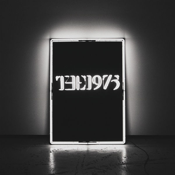
Many constants are dissimilar, although they all fit within the indie genre of music and have a stylish, modern effect. I feel that more conventions (such as a minimalistic theme and a consistent monotone colour scheme) could have been more prominent or frequent to improve the branding of Parables. Many artists/bands within this type of music have taken ideas and conventions directly from one of their music videos and applied them onto the promotional tools; for example Artic Monkeys - Do I Wanna Know? And The 1975.

Artist influences for the main product (music video) included Ed Sheeran - Thinking Out Loud, Sia -Chandelier, P!nk- Try, Lotus Flower - Radiohead, The xx- Islands and Robyn - Call Your Girlfriend. Despite not all of the above mentioned are placed within the indie genre of music, they all feature forms of choreographed contemporary dance with matches music visuals- this is something which is also clearly presented in My Body is a Cage. In terms of influences for the ancillary texts from pre-existing examples, Bombay Bicycle Club was my obvious main inspiration for design and layout as this was the basis of my homage on both the digipak and advert. Also, Franz Ferdinand - You Could Have It So Much Better; this album was one example which inspired me to create a pop-art style cover image for the digipak which was then translated on the advertisement for branding reasons.
(image of teacher feedback on video)
(image of teacher feedback on draft digipak and advert)
Audience feedback in relation to the music video largely impacted the final version. Comments from teachers concerning the draft version included the lack of a clear narrative within the video as ideas presented within the draft did not make it obvious that the female was an illusion in the room and simply a figure of the males imagination as he was desperate to keep her off of his mind. This is something we considered and improved when filming for the final music video as we ensured there was constant referral to the male being shown in the room alone and then switching constantly to the pair dancing together in the cage like space; I feel this constructive cristicm allowed us to enhance the effectiveness of the music video in comparison to the draft created previously. Other audience feedback was provided by peers who had viewed both the draft and final versions of the music video. Many agreed that in the draft, there were issues with the mise en scene as the pair featured in the msuci video failed to present personality and as a result the storyline was negatively effected. As a group, we thought about ways to improve this element and agreed on a better choice of costume for the couple. The draft verison seemed to portray the actors as a dancing duo which was not the intention. Instead, we decided to add a sense of formality and quirkiness to the styling of the male and female through the costume appearing much more suited to the complex storyline and giving the formality of the video consistency to make it much more effective.
Teacher feedback concerning the draft versions of the digipak and advert included "images not suited to the indie genre" and "too many plain black panels". I used this feedback to completely change my idea as I no longer liked my design or layout. After searching for inspiration around designing an effective indie style digipak I came across the Flaws album for which I decided to homage. This was something the teachers claimed was 'Stylish' and 'effective in representing the indie genre'. Feedback from peers were mainly give to me verbally after showing those around me at the time of creation. After design, it was made clear that the draft versions did not outline any relevance to the band or style of music produced by Parables; I gathered this mainly concerned the image featured.
However the feedback gained on the final ancillary texts suggested improvements.
(print screen of comments on digipak and advert)
Peers mentioned that it had a stylish appearance, which was something I intended to achieve. Colour schemes used were recognised and mentioned by a fellow student on the final version of the digipak, this is one of the main features of the design and has a huge impact on the audience. This has the ability to grab the attention of the audience and make a statement, giving an Impression of Parables- the fact that feedback regarding this is positive and states that colours are effective gives me confidence that the product is realistic and attractive.
(print screen of comment)
The element of professionalism was also mentioned by one of my peers, I feel this was inevitable on the basis of creating a homage as this has already been proven to be of an industry standard by the original designer producing the design for another artist/band. Also in this comment there was mention of 'maintaining the right level of busyness' which I feel added to the stylishness and is something which would entice the audience to pick up a copy of the album as take an interest in the information on the advertisement.
(print screen of comment)
A peer identified that my ancillary texts look similar to Bombay Bicycle Club's promotional tools, this was something which I was very pleased about as I had aimed to homage their work and the fact that it was recognised proves that I have done this successfully and effectively.
This is another encouraging first draft Lauren. You will need to explain why Lauren features on the digi and advert but NOT in the actual video, focusing on maintianing indie sensibilities will enable you to explain your choices. A simple way of also doing this will be to discuss style, Vampire Weekend Contra has a female on the cover of the digi and this helped them maintain their preppy style, you have attempted to create a stylish yet thoughtful/emotional/introspective feel to your products and Lauren's expression and your muted tones help convey this.
ReplyDelete