Saturday 29 November 2014

Digipak journey


This is the journey of ideas i had when creating my digipak and advert. I began to gather inspiration from existing albums which are inside of the indie genre. 

1. The kings of Leon album- Youth and Young Manhood. This gave me the idea for my draft digipak and advert as I found the use of the images effective. I liked the mysterious and isolated element given from the back cover of this album through the use of image set in a dark, creepy natural environment. The black and white filter on the image developed on this effect and suited the indie genre in which our band- Parables place themselves within.

2. Following on from the Kings of Leon album, I then further researched images of trees which portrayed a shadowed, isolated and mysterious effect. I used this as inspiration to give me ideas and a focus for when I came to taking the photos for the draft version.

3.  The next image on the journey shows one of my own images taken for the draft. using the research and existing digipak examples I decided to take images of the outside environment (including trees, leaves and a bridge.)

4. The 1975 album cover led me towards using a black and white colour scheme on my draft digipak and advert. I feel this is effective and suits the indie style genre.
7. Summerlin- Runaways album cover- I took inspiration from this and used it on my draft version of the digipak and advert. I loved the use of the black and white effect and the intriguing image. I felt this was a simple idea yet very effective and suited the indie genre very well.

8. I decided on the choice of colour scheme on the draft digipak and advert was black and white as I found this was a common idea among other indie bands and has the power to make a statement on the audience.

9.This is my draft digipak created for our band - Parables. I created this with the inspiration mentioned above in mind. I took the idea of using black and white as well as considering the bridge image having a similar theme as that featured on the Kings Of Leon album.

10. This is my draft advertisement. Again, taking ideas from the inspiration presented in the journey to create something which was a combination of many of the ideas.

11. PJ Harvey- Rid of me vinyl cover allowed me to see the effectiveness of a close up image being featured on the cover as I feel it is engaging and helps to express a sense of emotion which may summarise the album/ genre. This vinyl includes genres of indie rock music, therefore as this matches that of Parables genre, I feel this is therefore a suitable piece of research for me to take inspiration and ideas from.

12. Gemini - Wild Nothing album was something I found on a Google search of 'Close up album cover images'. I instantly took a liking to this design as it was something unique and intriguing. I became even more fond of the idea o using a close up image of an individual to feature on the front cover as research shows this is a commonly used convention of many indie artists/groups I hoped that my creation would also go on to look as effective and appealing as the existing albums I had researched.

13. The Smiths - Please, Please, Please album, again, helped me further explore the effectiveness of a close front cover image. This simple design has no reference to any of the tracks on the album yet effectively portrays the indie genre of the band. At this stage, there was still a clear theme of my interest for the colour scheme of my digipak to remain black, white and grey (monotone.)
 
14. This close up of Lana Del Ray allowed me to gain ideas of shots which would suit Parables digipak front cover. I liked the use of a close up shot showing facial expressions and began to explore the effectiveness of this.

15. Close up of a female featured on the cover of Slow Motion Music by Olivia Tank. This emphasised the effectiveness of this type of shot through making a statement and having the ability to interest the audience.

16. Bombay Bicycle Club- Flaws album. This was my main source of inspiration throughout the entire process of creating my final version of a digipak and advert. I took ideas on colour, text alignment, font styles and panel layouts. As this is a digipak created for an indie band, ideas would also match for Parables as they are also within this genre of music. I really liked the appearance of this album and felt that through using a similar design and layout, I would achieve a digipak and advert which would make a statement and interest the audience. I went on to homage after research on homage in industry. I found it incredibly effective and suited to the look I aimed to achieve- something bold, eye catching and interesting.

17. Peach colour scheme. This was an idea taken from the Flaws album which I felt would appeal to the audience and fit with the indie theme as it does for Bombay Bicycle Club. This direct copying of colour scheme was due to the nature of homaging a design. 

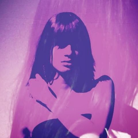
18. After looking at the cover of Flaws as well as researching close up images, I had established that I was going to feature a close up image of a female who has no significant relevance to the band or album. I took photos of one of our group members as she suits the type of look I was aiming to achieve to create a mysterious, stylish looking album cover image. Image 18 on the journey shows the shot of Lauren Bolton used on the cover before editing took place.

19. This is an example of pop art effects added onto a close up image of a female. This gave me ideas of how to change and edit my intended cover image in a way which appeal to the audience and looks interesting.

20. After gathering more ideas on the type of filter i could apply to the image, i decided to transform the image into a pixelated looking black and white version of the intended cover image to give me a better idea of the outcome. This led to the decision to add colour to the image as i did like the effect achieved through applying the filter on Photoshop, however i felt this was too basic and did not make the intended statement on the audience. My idea to design a homage of the Flaws album also meant that the colour scheme featured on this should be applied onto my cover image of Lauren also.

21, 22, 23. These are examples of existing digipak covers of indie bands. I was convinced on using colour at this point as i felt that it stands out. I explored the use of pop-art style cover images and the impact it has on the audience.

24. Final edited image of Lauren ready to be featured on the front cover of my digipak after applying the relevant colour scheme and photo effects in attempt of homaging the Flaws album with an added pop-art style effect to modify my own version.

25. Final version of Parables digipak. This was created in aim to homage Bombay Bicycle Club's Flaws album using the front and back cover panels as guidelines. This led me to create the remaining  4 inside panels on the basis of ensuring consistency through colour schemes, fonts, sizes, alignment, etc. I feel I achieved a stlylish, glossy looking final design after lots of research of how to effectively combine different elements of the images above.

26. Final Parables advert. As I homaged BBC's album cover to create my digipak,  felt it was necessary that I also homaged the design of the advertisement for the Flaws album to ensure consistency, audience recognition and an appealing design. I searched for the advertisement online and directly copied it in terms of colour scheme, image placement, fonts, sizes, alignment, etc. This mean that both final ancillary texts I had produced were stylish, of an industry standard and appealing in the eyes of the target audience.
 

Friday 28 November 2014

Final Advert

FINAL ADVERT
Keeping consistent with the digipak, I used the image from the cover panel to feature on the advert. This would increase album awareness, which is the intention. After seeing the advert through various forms of print media (inside magazines, etc.) the audience would be able to recognise this image and know more about the album due to seeing the same image featured on the album cover. The advert reveals details based on the album and gives a better insight into what to expect from this- however the element of mystery remains as the image is vague and unexplained- sparking interest in the audience and fans. The advert would contribute towards creating a 'hype' and excitement over the album and would as a result be likely to encourage further sales through this form of promotion. Font, colour scheme, right text alignment, website, and record label remains the same as used on the digipak to ensure associations can be recognised between the two by the audience, The bold, blocky text layout is appealing and would make a statement on the viewer, encouraging them to read and find out more about the album and release date- leading to potential sales. Central visual interest is something which has been achieved on the advert which makes it appear interesting and appealing to the audience and would draw attention. There is an almost centrally split divide creating a symmetrically attractive design that is well balanced, appealing the audience and making them more likely to notice the image and information presented.

Final Digipak


FINAL DIGIPAK:


My idea to create a pop-art style digipak was inspired by a number of existing effective designs of well known indie bands including Franz Ferdinand- You Could Have It So Much Better and Bombay Bicycle Club- Flaws. I feel the close up image of the female appears mysterious and intriguing to the audience, encouraging them  to develop an interest. As the image is so vague and the front cover is kept simplistic in design, the audience would be likely to wonder about the band and what relevance the cover has with the album; therefore customers are encouraged to purchase a copy. The colour scheme remains consistent throughout as the use of all three bold tones are featured together on every panel, resulting in an aesthetically pleasing look seeming industry standard. Due to the use of the bright peachy-orange, the cover image is powerful and able to make a statement- drawing the attention of passers by who would notice this on a shelf in store, etc. I particularly think this digipak is effective through it's strong use of expressive colours reflecting an indie/alternative genre; elements such as the paisley patterned shirt shown on the cover image female fits in with the style intended for Parables and would appeal to the target audience who would be fans of this style. Text used on the digipak is also kept consistent as I decided to consider my font research and use 'Orator Std' as it develops on the idea of simplicity and is easy for the audience to read clearly- avoiding confusion, The audience can recognise the name of the band as well as the title of the album subconsciously through the text and colour as the bright peach and white stands out against the bold black background on the cover. My decision to align the text to the right on four of the panels was inspired by Bombay bicycle club as they took this approach on their Flaws album. I feel this looks stylish and more blocky as a pose to the automatic left alignment on Photoshop. Use of 'Parables' on the CD disk is visible to the consumer to remind them of who the album belongs to. Again, a simple idea contributes towards the effectiveness of the overall product as the band name displayed in peach makes a statement layered on the white background of the disk as the same time as preventing confusion among the copy owner. I also branded the product through creating a record label for 'Aeroplane records' which is featured o the back cover panel as this is used in industry on every digipak produced, adding to the professional appearance. The continuous use of black strips featured on the front and back cover panels as well as the inside covers appears slick and pleasing in the eye of the audience as the consistency and boldness of this element creates an edgy, sharp feel to the appearance.


Digipak Journey


  1. The first two images show The XX's first two album covers, these have inspired me greatly within this journey because they show a very minimalistic style and it is something that I wanted to showcase within my design. The effortlessness that this style shows us is something that is very eye catching as well as being something that not a lot of bands would do. It tells us the name of the band as well as making a statement, which is something I tried to replicate.
  2. The next image is of Justice's album, Cross, this design such as the last one is something that I tried to emulate. This is because the simple design and lack of colours was something I wanted to replicate as it really can become a classic. When researching different minimalistic album covers I found websites that showed the top 10 minimalistic designs, this being one of them. This inspired me even more then because I wanted to make something that would have the same prestige.
  3. The next two images show moon designs, and an actual picture of the moon. The first image shows a 'full moon in the gemini' and what I liked about this was the colours and the way that this artwork was set out. It looked very original and gave me the idea that I wanted to do an abstract moon design. The next image is of a full moon and just gave me more inspiration of what it was that I was producing.
  4. The next four images are of 4 different minimalistic album covers (Prince - The Black Album, Arctic Monkeys - Suck It And See, Arctic Monkeys - AM, Jamie XX - We're New Here) all of these albums have a quality that I wanted to get across in my design. It was important for me to find designs like this so I knew that they worked in conjunction with the ideas I already had in my head. I wanted to know that these designs were common in this field, and it seems like they were so that helped in producing my design.
  5. The grey panel at the side of the page is to show the main colour scheme that I wanted to use, the use of this fairly dull colour is to make the whole digipak look more sophisticated and slick. It was important to me to get a interesting feel and look to my digipak and I didn't want to make it too flashy considering I was planning on using textures within the design also. I wanted to make sure that the textured effect did the talking.
  6. The next three pictures on the second row show my main inspiration which is Arcade Fire, because we are doing this band's song it meant that taking inspiration from their digipaks and general looks as well was very crucial to the development of my work. Here I have a picture of the front cover of their most recent album, Reflektor, as well as a poster from that tour. I have also found a screen shot from the video of the first single off of that album, and I like the use of the mirrored sphere in the background of the shot. This is something that I thought could be relevant to the band and therefore connect to my own design.
  7. The next picture shows a close up of a rock, even though this is a fairly odd thing to use as inspiration, I have found that looking at pictures such as this has given me lots of ideas in how I want to present the 'moon' theme. The colours as well is something that inspired me and made me realise that I wanted to keep going with the colour scheme that I originally had in mind.
  8. Next, is my first digipak design. I was quite proud of this design as I felt as though it represented the genre of music I was producing as well as the band I was also representing. Having a design that fits with the rest of the work and works well on its own or with seeing the video is crucial. This is because it has to look realistic and believable as a digipak and as a first effort, I believe this was achieved.
  9. The next image also shows a textured effect that I was curious to try. As I have previously stated, I am interested in finding images such as this because I allows me to see exactly what I want to do and how that can be achieved. The textured effect was very important to me so finding this and many other effects allowed me to be more creative.
  10. The next image shows Digitalism's album I Love You Dude, This also was an inspirational digipak cover because of the central element of the digitalised love heart which I used as inspiration for my own central image. That is essentially what I used, also the plain background was something I wanted to emulate.
  11. The next images include the fonts and colours that I was intrigued to use on the spine and the back cover of the digipak, I had to create a lot of options of what I wanted to produce because it gives me more of an idea then to how I wanted to go about the final design. As I had criticism from my teacher's in regards to the font I used and the darkness of the colours, it meant that this was of prime importance to me.
  12. The next two albums shown also have elements that are showing dramatic geometric designs that are eye catching to the viewer. They were designs that I was very inspired by and also made me realise that these types of designs are traditionally seen throughout the industry and it wouldn't be uncommon if I did something similar.
  13. The next design is from a Pet Shop Boys album, this was something that very much helped within the process of my design making. The use of the central image was something that I was trying to find to make sure that it was relevant to what I wanted to produce, Even though The Pet Shop Boys are not within the same genre of my chosen band, their design was still beneficial for me to see.
  14. The next two images are painting (Black Circle (1913) oil on canvas. State Russian Museum, St Petersburg. By Kasimir Malevich. and Primary Light Group: Red, Green, Blue 1964-65. Jo Baer) they inspired also because of their use of central simple images which is obviously something that I definitely was intending to stick to.
  15. This is my final design, the only real difference is the colour has been lightened slightly.
  16. The next three final images are minimalistic film posters which I took inspiration from throughout because of their simple design and ability to look more busy than they are which is a style and vibe that I wanted to emulate throughout my design.


Wednesday 26 November 2014

Digipak Inspiration


All of these images have inspired me with my digipak and advert, having these images to base my designs on is useful because I then get to see what other people have produced and I can make something more professional because of this.

Monday 24 November 2014

Digipack journey


  1. The first cover of ACDC shown inspired me from the font used on the cover.
  2. The inspiration came from the simplicity of the cover 
  3. I have been experimenting with different texts to see which would suit my raft design best.
  4. This third cover is a well known band i like the use of the colour black and white and also the font used is different to anything already produced.
  5. The arctic monkeys cover inspired me from the plain line that is used across the middle o the cover.
  6. The next three colours are the ones that i chose for my draft, i feel that the green is striking and will strand out.
  7. Again on this cover i like that lines that are used, however these lines create a shape within the cover.
  8. I like the plain text used in the middle of the page.
  9. The three smaller images underneath i like because of the colours used and also the bold fonts.
  10. The Emile Sande cover inspired me because of the focus on the center of the picture and the colour difference.
  11. On the next cover i have chosen i like the contrast of the bole block colour of block and white with one colour that's different to the rest. I feel that a lot of my inspiration will be taken from this for my draft digipack.
  12. The next 4 smaller covers i took the inspiration of the texts used and also the colours of the plain black and white.
  13. My next cover i like the sharpness of the two colours as i feel that they are contrasting to one another.
  14. The next four pictures i have chosen is purely for the colour and the sharpness of them.
  15. This is my first draft of the front cover of my digipack. i have taken inspiration of using one block colour like on the e xample cover however i decided to use green as i feel it stood out more. then i have take the other two colours of black and white which are shown on most of the covers. also i used the lines and took inspiration from a couple of the previous covers. then chose a font that i liked and added it onto the front cover. this is how i came to make my draft cover. from having feedback form my draft I changed my idea as I was told the lines had no meaning and looking back at it now I can agree with this as there was no reason for them to be there, I then continued to research for other cd covers.
  16. I then chose 2 colour palates, again keep the back and white theme throughout my original idea.
  17. The next cover with the black and white with the pink/red writing inspired me because of the use of shapes that were used on the front cover.
  18. the cover with the triangle and colours running through the ,idle inspired me as there was still a black and whit theme, however the bold shape I can also take inspiration from.
  19. Again this next cover I got inspiration from the colour and the different patterns that were used throughout.
  20. The next 2 smaller images I chose because of the block shapes and bold colours, even though one of these isn't in black and whit I can use it as inspiration as the sharpness of the shapes has inspired me.
  21. The next cover I have chosen is very different however I liked the different shapes and lines that were used on the front as it made the cover look random and stand out from others.
  22. The XX cover I have chosen I like because of the simplicity and the plain colour choice, this is how I wish mine to be like in the final digipack.
  23. Again I have looked at a various amounts of fonts that I could use on and throughout my digipack design.
  24. I found this cd cover and immediately loved it as it was bold clear and straight away stood out and appealed to me, I would love to incorporate this into my final design.
  25. And these final 3 covers gave me inspiration from the block shapes used, however I will want to have the colour as my original idea and keep to the black and white theme.
  26. Finally this is the final design that I came up with, I feel that I have taken some aspects of different covers and have made a big improvement from my draft, I think that it looks slick and professional.

Digipak research

Style Research:


I liked the idea of a pop art image being displayed on the cover as it would stand out and draw attention to the digipak. The use of a close up image being transformed into pop art was something which I thought would suit the quirky genre of the music featured on the album and would create an image for the audience to develop and interest in.


Colour Scheme and layout research:


The layout for my digipak was largely inspired by Bombay Bicycle Club- Flaws. I liked the simple designs which were kept through fonts and colour schemes. The overall appearance of the digipak makes a statement and leaves an impact on the audience.

Indie representations:


Themes within my digipak and advert are similar to those featured on 'Flaws'. I recreated the image of the female on the front cover using a peer to model. The expressions are vague and minimal creating a mysterious and interesting feel about the album. The indie genre is also presented through the mise en scene of the album cover image. The clothing/styling of the model used includes a paisley printed shirt; this is not in line with current trending fashions and is therefore appealing at typical indie individuals, enticing them to take a look and develop interest in the album as it appears to fit their preferred genre. The fonts and layout are also outside of typical digipaks created for bands in genres excluding indie/alt. Features including the right alignment and thin, basic fonts used all contribute towards achieving a 'different' yet effective look for the digipak and advert.


Monday 17 November 2014

Final Digipak and Advert - Lauren Bolton


As you can see here, this is my final digipak and advert design. Everything still looks rather similar to my draft design, however that is because it worked so well. The only major change to the actual digipak itself is the removal of the band members from the bottom of the inside cover. Also I have changed the font from looking too 'deco' to something a bit more quirky and relatable to the genre of music that I am channeling. Other than that, there is nothing really that has changed too dramatically and I am pleased with the overall finish. I have taken my main inspiration for the whole look from a number of places, mainly the simplicity of The XX's albums have been something that I have really enjoyed seeing and getting inspired from their originality and effortless design. 
However, I would say that I have tried to be as original as possible because I have never seen this type of design before and therefore it is something that I am pleased to have created, as I feel as though it represents the chosen genre and style of music really well. The circle design that I have created for both my digipak and advert represents the album name which is 'eclipse' and the smaller circle rising up to the larger one shows the power that the 'underdog' can have. Which for the band we have created, and this being their fourth album, it is referencing to their rise to fame and success. Thinking of a design like this wasn't too difficult because I already knew the type of image that I wanted to create and because I knew that I wanted it to be very clean cut and eye catching, that led me to this idea.
The circle image is a motif that can be seen throughout both the digipak and advert, it is good to be connecting these two designs together because if the advert even looked slightly different then it wouldn't be good promotion for the album because the consumers would get confused as to what the advert was trying to tell them.
The advert itself is a very different and original design, I decided to not put any information onto this piece because I have seen many album adverts in the past that have done this with good effect. The sole reason why I decided to do it then was for the fact that this is Parables fourth album; they would already have legions of fans as well as new coming fans that would recognise what this meant. This design is just meant to stir up excitement for what is to come and it also inspires the readers of the magazine that this advert would be in to research what this all meant. It's sublimely advertising to make the consumers find out the information themselves and for them to realise that by going and looking for the information that they are intrigued enough that they want to hear the final album because of that initial curiosity.
Throughout the digipak and advert as well, I have used the motif of the textured grey background; it is in use on the actual digipak, the digipak insert and also the advert. I really liked the whole look of this texture rather than it being a solid block colour, it allows for the design to have some well needed depth because as this band is heavily inspired by Arcade Fire it means that they need the same amount of depth as they have. 
The whole design is very simple, and looks very effortless. This band Parables are one of those bands that do things in an effortless fashion, knowing that for what they do would take other bands years of experience to match them. Thinking about all of this information and drawing up a good and clarified back story has allowed me to create the digipak and advert with ease because I was able to get myself into the mindset of what this band would want and do. The precision of the circles and the depth of field they give allow the consumer to be sucked into their world of music. Just like Arcade Fire do.
The font I have chosen as well for the digipak is something that looks very quirky, and it can be said that it doesn't entirely match the look of the circles and their simplicity. It is a very busy font, however that is what I wanted because I wanted that contrast of the simple and the busy.
I added an insert into my digipak design because I wanted there to be more information about the band and what they did to create the album, again creating that back story to make them more believable and real. I do think I could have added more information to the insert however to keep it more in tune with the design as a whole I stripped it back to being the most basic information so that the secrecy that the band has is kept. 

Friday 14 November 2014

Creating the final dance

Creating this final dance was a challenge as we didn't have a lot of time, we only had 2 days for 1 and 1 1/2 hours at a time so this was a challenge to get everything in, however we were both focused on task and managed to get some of the tasks done however we didn't finished it all so on the day of filming we had to make some sections up on the spot although on the final piece it looks slick and well rehearsed.

Equipment used

Camera - The camera that we used was a .... its not a professional camera so hasn't got the best of qualities, however once all our shots have gone through final cut pro we have changed the colour of the film to black and white as it fits in better with our theme to show the emotions across more.


Tripod - The tripod helped us keep a steady shot throughout the side shots we were filming also we were able to adjust the height so that we had the dancers central of the screen. A tripod is a portable three-legged frame, used as a platform for supporting the weight and maintaining the stability of some other object. A tripod provides stability against downward forces and horizontal forces and movements about horizontal axes.

Shoulder stand - We ordered in a shoulder stand so that we could keep a steady shot when moving around the room to create stability for the camera filmer.


Lights - Light's radiant energy, in these circumstances they are producing shadows on the back wall also we learnt about three-point lighting, this is a standard method used in visual media such as theatre,video, film, still photography and computer-generated imagery.