Style Research:

I liked the idea of a pop art image being displayed on the cover as it would stand out and draw attention to the digipak. The use of a close up image being transformed into pop art was something which I thought would suit the quirky genre of the music featured on the album and would create an image for the audience to develop and interest in.
Colour Scheme and layout research:

The layout for my digipak was largely inspired by Bombay Bicycle Club- Flaws. I liked the simple designs which were kept through fonts and colour schemes. The overall appearance of the digipak makes a statement and leaves an impact on the audience.
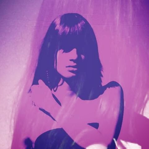
Indie representations:

Themes within my digipak and advert are similar to those featured on 'Flaws'. I recreated the image of the female on the front cover using a peer to model. The expressions are vague and minimal creating a mysterious and interesting feel about the album. The indie genre is also presented through the mise en scene of the album cover image. The clothing/styling of the model used includes a paisley printed shirt; this is not in line with current trending fashions and is therefore appealing at typical indie individuals, enticing them to take a look and develop interest in the album as it appears to fit their preferred genre. The fonts and layout are also outside of typical digipaks created for bands in genres excluding indie/alt. Features including the right alignment and thin, basic fonts used all contribute towards achieving a 'different' yet effective look for the digipak and advert.
No comments:
Post a Comment